The making of app monitoring: the health dashboard
Customers telling me our app is slow? I'm looking at a response time graph.
On the front page of Hacker News? I'm looking at requests per-second and response time on a graph.
Lots of things going wrong? Show me ALL the metrics.
The challenges with building a one-page dashboard of app health?
- What's important to me today might not be tomorrow
- I need to see all key metrics at once to ensure I'm not missing a correlation (ex: spike in response time and error rates)
- Ability to magnify a metric on a chart for more details
The first step is admitting I have a problem
We track eight key health metrics for our applications:
- Response Time by category (time spent in Ruby, Postgres, Elasticsearch, etc)
- Throughput
- Error Rate
- Apdex
- Capacity % (the utilization of our application worker processes)
- App Instances (how many processes are serving our app across all of our nodes)
- CPU Usage % (average cpu usage of the app on each node)
- Memory Usage (average memory usage of the app on each node)
So, what are some approaches to help me get an at-a-glance view of app health?
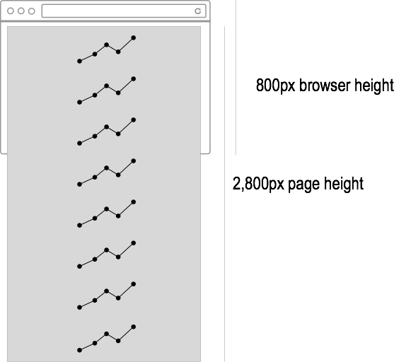
1. Stack timeseries charts for each metric vertically
Let's start simple: we'll put a timeseries chart for each metric, one per-row, 350px in height (including margin), on a page.
That's 2,800 pixels in height. My MacBook has a screen height of 800 pixels, so unless I build a script to continuously scroll up and down and take a hit of dramamine, I'm not going to view all the metrics at once.
A scaled representation is below:
2. Throw some sparklines at it
A good chunk of the time, I care about trends, not absolutes. I care if our response time is increasing, but not the absolute value of it (as long as it is acceptable).
Sparklines are great for this - you can grasp where a metric is heading with little space: 
If I had a 140px x 20px sparkline for each of our 8 metrics, I could actually fit them in a single row across my browser window. I've got at-a-glance app health!
...but wait...it's very common that I need to interact with a metric on a chart to look at values in more detail. Sparklines are too small to support this kind of interaction well. It's also very helpful to view some metrics with stacking (ex: response time by category) - that won't fit well in a sparkline.
3. Bundle it
Where we're at:
- Larger charts allow you to dive into metrics at specific points in time well, but take up too much space if you do this for every chart.
- Sparklines give an at-a-glance view of trending, but are too small to support interaction.
As Comcast says, bundle it!
The display I settled on: a large chart above a row of sparklines for each key metric:
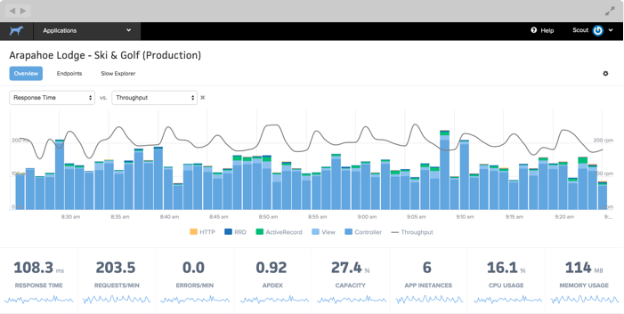
- By default, the large chart compares response time and throughput. Issues in other areas of our app often bubble up here, so they make sense as defaults.
- Sparklines for every metric are below. It's easy to see overall trends.
- Click on a sparkline to view it in the large chart.
- Save the UI state via
pushState(). If I want to share a view with a colleague, they'll see that state (ex: putting the error rate in the large chart).
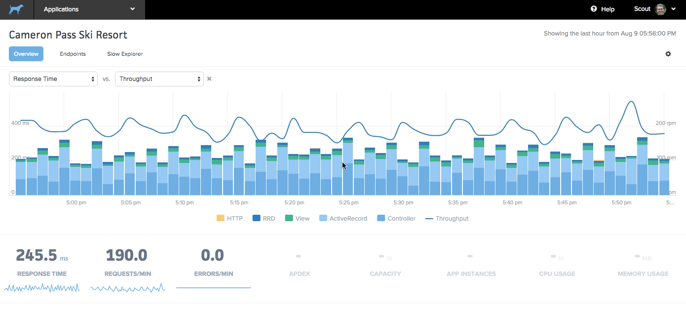
Here's a sample interaction. Note that the blank metrics aren't yet available, but will be during our BETA period:
Sign Up for Early Access
Visit scoutapm.com to sign up for early access to application monitoring.
Follow us on Twitter for more as we build the app monitoring solution we've always wanted to use.